Can Graphic Design Save Your Life? is a new exhibition at the Wellcome Collection which explores how graphic designers have encouraged us to change our health habits.
Comprising over 200 objects including hard-hitting posters, flashing pharmacy signs, iconic pill packaging and digital teaching aids, the exhibition considers the role of graphic design in constructing and communicating healthcare messages around the world, and will show how graphic design has been used to persuade, to inform and to empower.
One of the highlights of this exhibition, curated by graphic designer Lucienne Roberts and design educator Rebecca Wright, is Florence Nightingale’s Crimean War charts showing mortality in the British Army during that war. Her records proved that more injured soldiers were dying from infection than were dying from their injuries. These charts enabled her to present her information to the authorities which in time led to better practice in nursing.
Today it seems shocking that in the 1940s and even 1950s it was widely believed that smoking was good for you. Advertising was partly to blame: The exhibition tackles the role graphics played in shaping attitudes towards smoking and focuses on The Silk Cut campaign, created by Saatchi and Saatchi in 1983 in response to legislation restricting tobacco advertising in the UK. This ingenious campaign ran for around twenty years before the government’s ban on tobacco advertising put an end to it. Graphics from the Silk Cut Campaign in the 1980s are displayed alongside objects showing the transition to plain packaging and anti-smoking imagery found in formats as small as postate stamps from around the world.
This exhibition will highlight the widespread and often subliminal nature of graphic design in shaping our environment, our health and our sense of self. Drawn from public and private collections around the world, it will feature work from influential figures in graphic design from the 20th century, as well as from studios and individual designers working today.
Can Graphic Design Save Your Life? Opens with flags showing the emblems of the Red Cross, the Red Crescent and the Red Crystal. Rarely displayed together, they are some of the wo’ld’s most recognisable, powerful and highly protected symbols, used to depict neutrality and provide safety in conflict zones. The exhibition also reveals the imaginative educational approaches taken to instruct us about our bodies from 16th century anatomical pop-up books to the Tiny Bop learning app, as well as Planned Parenthood comic books advocating safe sex.
The role of design in informing and orienting people in hospitals is explored through the use of signage and fonts, as well as resources that help to identify and communicate different types of pain. Colourful schemes for children’s wards, designed by Studio Rubio Arauna, Studio Rejane Dal Bello and Studio Myerscough, in Barcelona, Peru and London respectively, further demonstrate how graphics can be used to transform the hospital experience and improve patient wellbeing in settings traditionally considered as intimidating or unpleasant.
Items from the archive of Burroughs Wellcome & Co., one of the first companies to market directly to doctors and to rigorously enforce trademarks and brand, provide some of the earliest examples of corporate identity in the pharmaceutical industry. Further studies include the iconic Bayer identity and the influence of the pioneering and modernist design studio at Geigy. The exhibition also considers how graphic designers deliver clear healthcare instructions to consumers through carefully designed colour coding systems, written instructions and pill packaging.
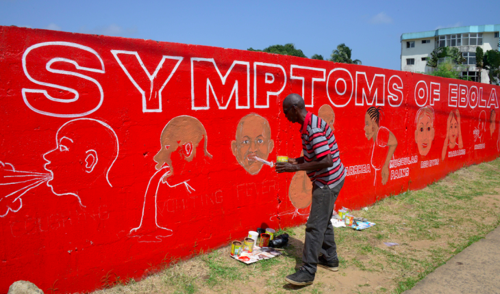
The front-line response in battling epidemics continues to be crucial in global health. From Italian renaissance plague notices to a hand painted mural depicting Ebola symptoms during the 2014 outbreak in West Africa, graphics provide an immediate and important way to convey information as medical crises unfold. Further examples include Abram Games’ anti malaria poster, the AIDS: Don’t Die of Ignorance Campaign from the 1980s, and a mosquito-killing billboard used in Brazil to raise awareness of Zika.
The final part of the exhibition considers how graphic design can empower people and provoke an individual response. Exploring the principles of Ken Garland’s First Things First manifesto, which called for graphic designers to use their skills for good, this section features several impactful campaigns. This includes the Scottish Government’s 2009 Kill Jill poster that significantly increased organ donation rates and the Samaritan’s award-winning Network Rail We Listen advertisements.
Although the links between graphics and health may not be immediately obvious, the Wellcome collection show does a great job of illustrating the connections.
Can Graphic Design Save Your Life, at the Wellcome Collection, Euston, (7 September 2017 to 14 Janury 2018) t. 0207 611 2222 wellcomecollection.org

The Oldie magazines. She also works for the NHS and is the Hippocratic Post's roving reporter.
- People’s Choice Victory for Down’s Syndrome Scotland Garden at Chelsea 2025 - 28th May 2025
- Cadogan: A Chelsea Family By Tamsin Perrett - 3rd May 2025
- Dream Worlds a new exhibition in Cambridge - 14th December 2024